Rethinking the Poste Italiane Filatelia E-Commerce Experience
Thorough redesign of the web-based shop for philately goods and stamps sourced from Poste Italiane, backed by a study phase aided by ardent users of the actual platform.

2025
1 week
E-commerce
Poste Italiane
UX UI Designer
Challenge
In December 2024, the Italian Post inaugurated their new e-commerce platform catering to philately enthusiasts. Since its release, feedback has been predominantly adverse: the site suffers from sluggish performance, disarray, and common issues with completing purchases. This has led to profound dissatisfaction amongst users, a significant increase in site desertion, and a considerable decline in the conversion rate.
NB: For the purpose of this personal project, I focused on the desktop version given that 73% of the users navigate this e-commerce via this device.
Results
Post-redesign, the task success rate was 83%, with an average time of 67.4s to fully complete a check-out from the product page.
All the users completed the checkout and demonstrated enthusiasm during the follow-up question on the experience.
83%
Success rate
67.4s
Avg time to fully complete the check-out from product page
111.3s
Avg. time spent navigating and engaging with the homepage

Stack


Process
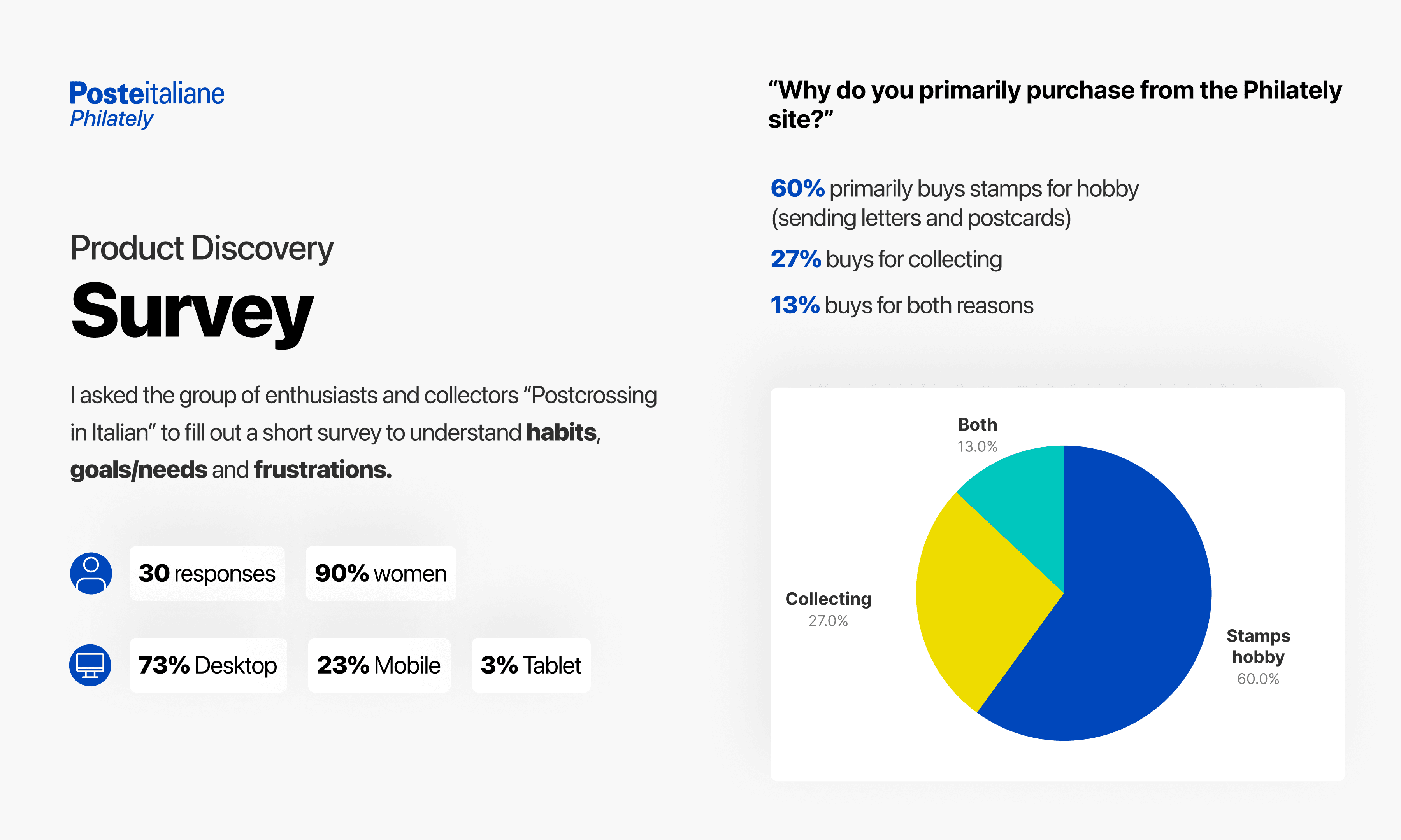
Research & Analysis: I conducted user interviews and a survey among real users and passionate collectors of stamps and philatelic items, offering a collectible postcard as compensation to those selected for usability testing. The participants included both "postcrossers" and collectors. Additionally, I performed a benchmark analysis, examining various e-commerce platforms, including both direct and secondary competitors (USPS.com, DeutschePost.de, Amazon, and Zalando).
Information Architecture: Based on the research findings, I restructured the website navigation and content, prioritizing features and information according to user needs. One of the most common pain point, was indeed the confusing information architecture and the impossibility to directly find a specific category of products (i.e. stamps vs philatelic postcards).
Wireframing & Prototyping: I've sketched low-fidelity wireframes to visualize the new layout and navigation, iteratively refining them based on user feedback. Afterward, I built a high-fidelity, interactive prototype on Figma to test the design through Maze.
Usability Testing: I conducted usability tests with a diverse group of users (a collector, a postcrosser and a specialist of "marcofilia", to validate the design and identify areas for improvement. Based on the feedback, I made necessary adjustments to the design. Especially the filters for the products page, who needed a refinement in terms of categories and position in the layout.
Visual Design & Style Guide: I then developed a cohesive visual language based on Poste Italiane brand identity, including color schemes, typography, and iconography, ensuring consistency throughout the website.


“ Navigation on the site was smooth and intuitive. All the main sections were easily accessible, and finding the desired stamps was very simple thanks to the well-organized filters. I also really loved the layout, which is well-designed, with a clean aesthetic and very clear images of the stamps. The purchase simulation process was quick and straightforward. The description of the steps to follow was clear. I really like the way the stamps are categorized. Great job! ”

Claudio
Usability testing partecipant
Conclusion
The revamping of Poste Italiane Filatelia e-commerce successfully addressed the core usability issues and improved the overall user experience as highlighted from the test sessions. By focusing on simplifying the interface and rethinking the information architecture, I was able to create a more efficient and enjoyable platform for users. The significant improvements in user engagement, satisfaction, and "happy paths" rates underscore the importance of user-centric design in achieving business success.