Simplifying complexity: a Vo-IP case study
The client's need was to restyle their VoIP platform (widely adopted from banks to PAs) in terms of UX and UI (and also to refactor the code). This project was quite complex, because it involved many different stakeholders and also had some very technical sections. Their platform had a chaotic information architecture and many confused flows, plus an old look&feel. The tickets opened to the IT dpt, because of UX issues, were a massive number on a monthly basis.

Maticmind
2024
SaaS, VoIP, B2B
Sole UX UI Designer
Challenge
Simplify the user flows
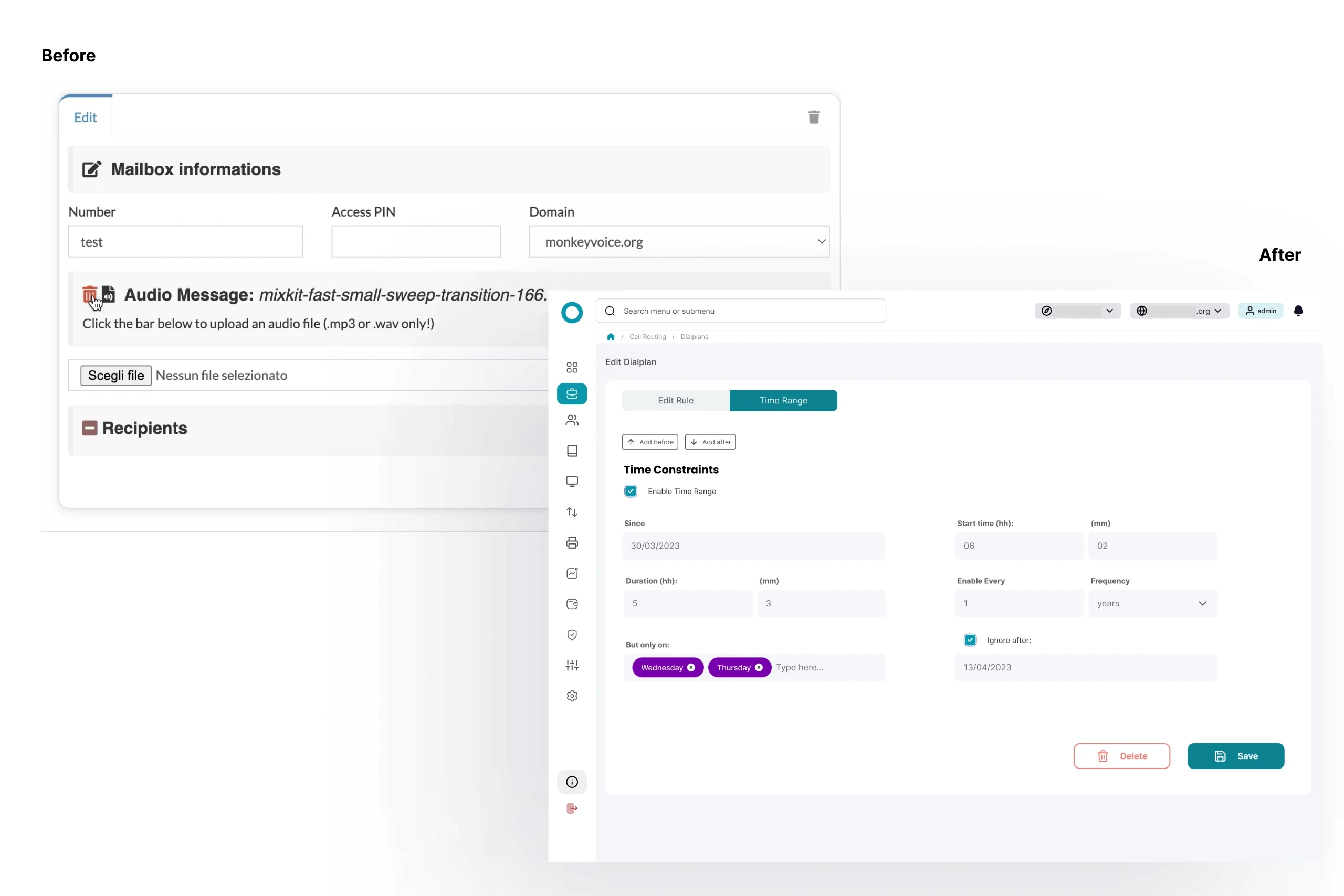
Refresh the old look and feel
Apply design patterns & heuristics
Talk to many stakeholders
The huge limit: not changing the information architecture/navigation
Results
Around 33% less tickets for the IT dpt
More than 4 new clients adoption (at the time I was still in the Company, some months after the release)

Process
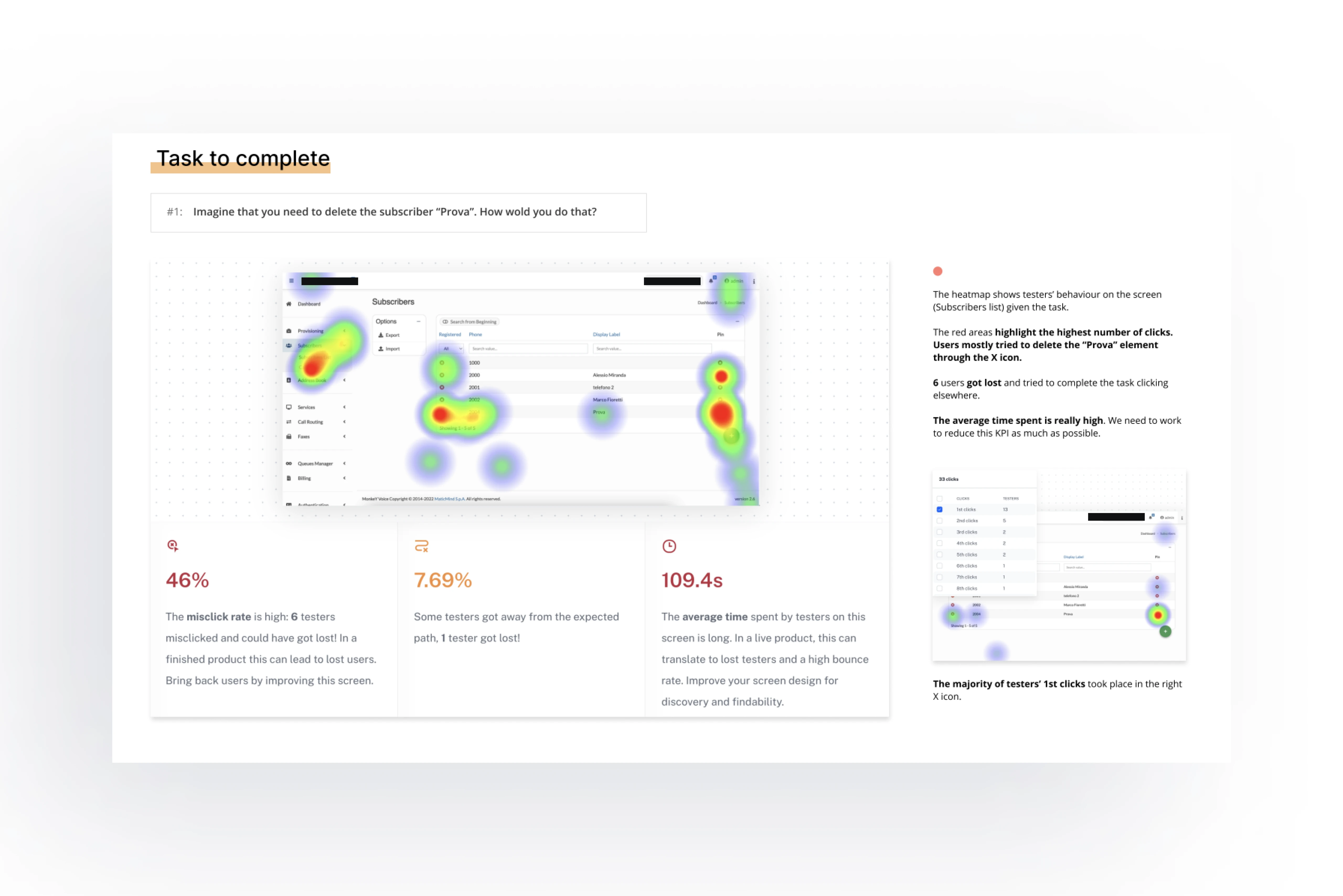
Research & Analysis: I conducted user interviews, and analyzed Jira analytics to understand the pain points and user needs. I also conducted heuristic analysis and usability testing on the platform as it was.
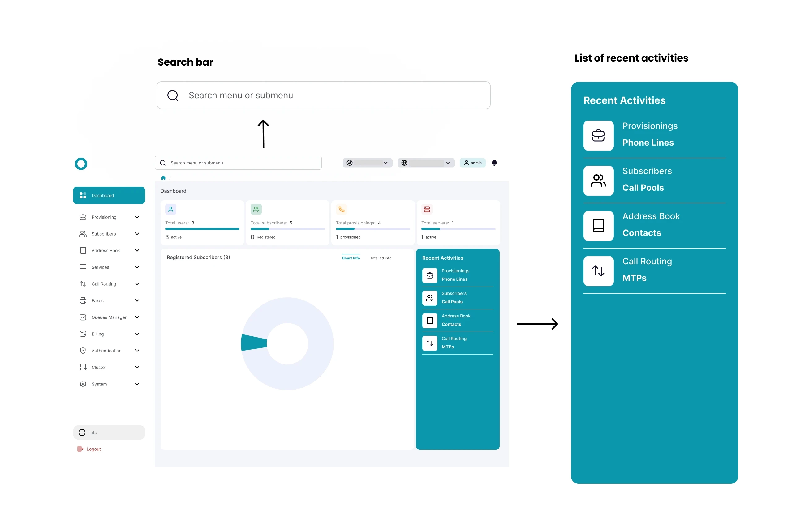
Information Architecture: Given the constraint imposed by the client, who didn't want to change the IA, I studied two solutions: introducing the Search bar and the "Recent Activities" component. The interviews showed that most of the users would often navigate the same sections, often hidden and nested in the big information architecture tree.
Workshops with Developers: I managed to involve the developers in the ideation process, to discuss with them on the feasibility and constraints.
Wireframing & Prototyping: I designed low-fidelity wireframes to visualize the new layout and navigation, iteratively refining them based on user feedback and presenting them to the client/stakeholders involved on weekly meetings. Afterward, I built a high-fidelity, interactive prototype to test the design.
Usability Testing: I conducted usability tests with a diverse group of users to validate the design and identify areas for improvement. Based on the feedback, I made necessary adjustments to the design.
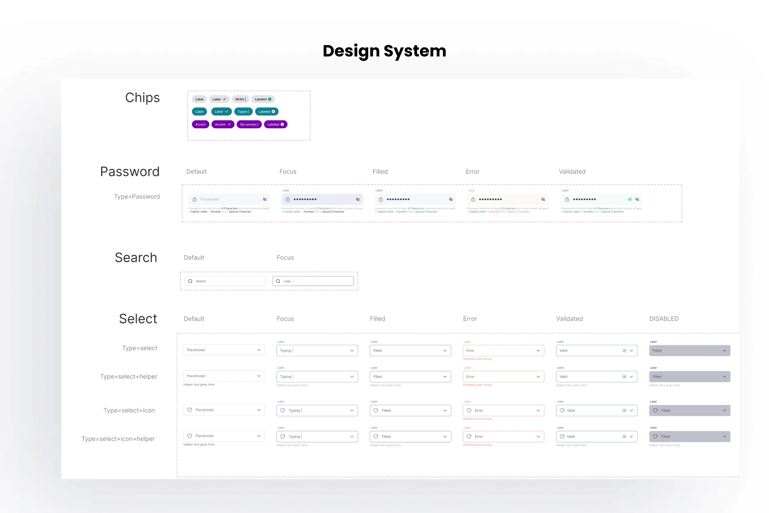
Visual Design & Style Guide: I developed a design system with a focus on accessibility, including color schemes, typography, and iconography, ensuring consistency.


Conclusion
Having to deal with techincal and business constraints, this project taught me how to think outside the box and find solutions for complex issues in very techincal environments such as a VoIP platform. The collaboration with the developers, during the ideation phase, ensured the respect of the deadline.