BonusX helps people in Italy understand which government bonuses and benefits they’re entitled to. The user profile — personal data, household members, financial situation — is the core of the product: every bonus application is based on this information.
The previous profile had a significant friction point causing drop rate: users often had to complete entire questionnaire sections just to update a single field. Household data, in particular, was split across two separate questionnaires with different structures.
Within my first 3 months at BonusX, one question was already clear: “What if the profile only asked for what’s needed, when it’s needed?” I started exploring the domain and designing a solution — knowing this was a large project that would ship across 2 quarters.
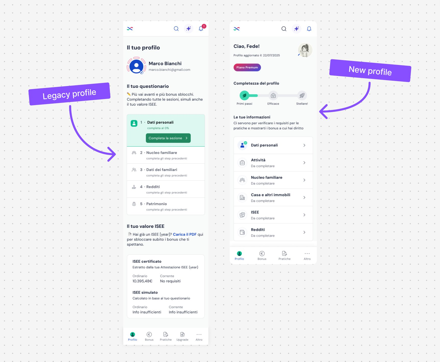 legacy profile vs new profile
- New onboarding completion rate: 95%
- Sign-up conversion went from ~5% to ~10%
- Request time reduced by up to 50% for key services
- New categories and entities added in subsequent quarters fit into existing patterns without UI or code refactors — the bet on scalability paid off
UX/UI design end-to-end on the new profile architecture, focused on dynamic flows, family data, and — above all — a design built to scale: the roadmap included new data categories in upcoming quarters, so every screen had to be able to “accommodate” features not yet defined.
A project of this scale doesn’t get designed alone. The Product Lead managed the overall architecture and phased release roadmap, and was especially valuable during the critical discovery and validation phases; together with the Welfare & Tax team — who defined content and question eligibility logic — we validated the user flows; I then managed the handoff with the engineering team to ensure the scalable patterns were implemented correctly.
- I ran interviews and usability tests to understand where users got stuck in the existing questionnaires, especially in the household flow
- I designed dynamic flows: instead of fixed sections, the system only asks for fields required by each specific request (fast-forward to missing data, direct editing without repeating the entire questionnaire)
- For household data, I unified the two questionnaires into a single flow: first establish who is part of the household, then add details for each member with direct editing from the list
- I used Cursor + Claude to rapidly prototype flow variants for testing, compressing the cycle from hypothesis to testable prototype
- I designed components with extensibility in mind: lists of “entities” (family members, activities, assets) built as a reusable pattern, not hardcoded for current fields
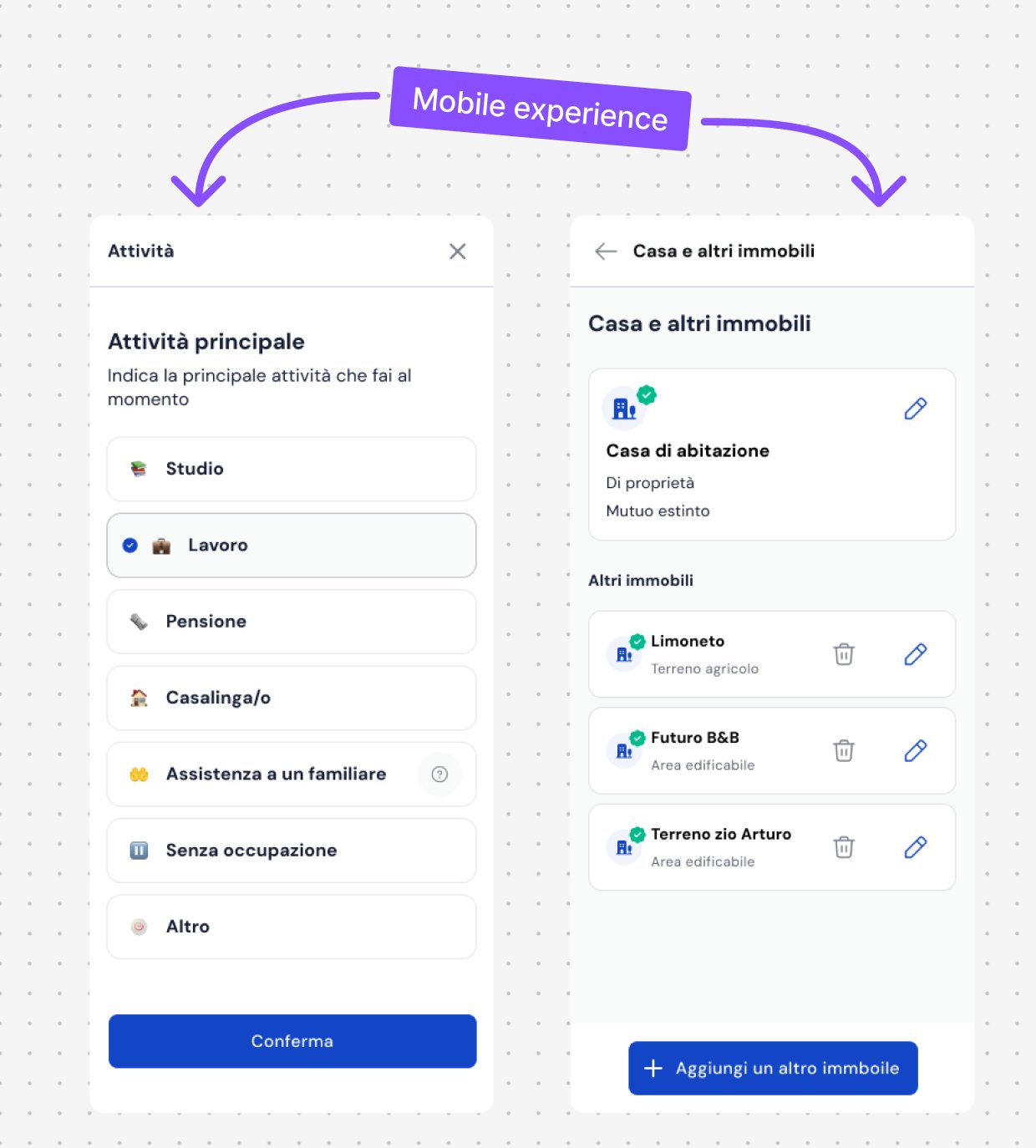 mobile experience — dynamic flows and editable entity lists
Designing for what doesn’t exist yet
Since the new profile rollout would happen in phases, and since we knew new data categories were coming in subsequent quarters, I deliberately prioritised a scalable layout from the start.
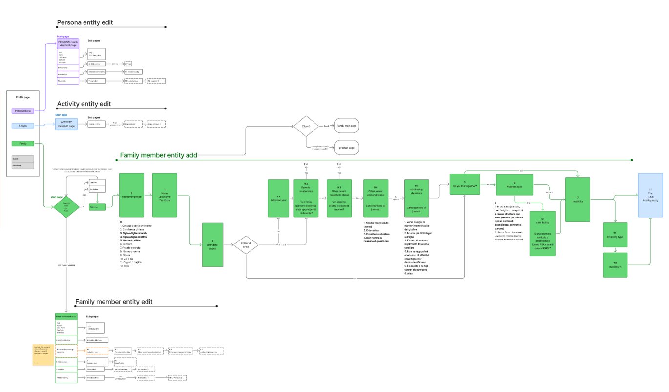 the scalable flow/entity system behind the redesign — family member, activity and personal data
In a live, high-traffic system, designing for scalability isn’t an added cost: it’s the only way to keep every new feature from becoming a mini redesign.
And vibecoding the test prototypes let me explore more flow variants in the same time I would have spent testing just one.